Saturday, November 27, 2010

11/27/10 Art History I

Today's Class- Today the class took the 2nd midterm exam, this one covering Early Christian through the Gothic, or everything in Book 2. After that, we started our study of non-western cultures (Book 3) with a look at the art of India.

Important Concepts-

*The similarities of ancient Indus Valley civilizations and those in Egypt, Mesopotamia, and the Aegean.

*The general characteristics of South Asian figure art.

*The introduction and evolution of Buddhism and Hinduism in India.

*The similarities and differences between Buddhist and Hindu art in Asia

Homework- The next current arts event article is due for next week's class.

For next class 12/4/10- Today's exam will be returned and reviewed, and then we will continue our look at Asian art, with Ancient China, Korea, and Japan. Bring Book 2 (A View of the World) and a notebook.


Tuesday, November 23, 2010

11/23/10 2D Design


Today's Class- Tonight we had our special Thanksgiving week Tuesday meeting. We did a portfolio exercise involving a classic still life painting. Unlike the limited palettes project, the goal tonight was to match the local colors of the objects in the still life set up. The season temperature collages critiqued last week were returned graded.

How to make this up- Set up a still life. Put a small box on a table, drape with a multicolored cloth (I used a plaid tablecloth), and arrange 4 solidly colored objects of different colors on and around the box. You may sketch it first with pencil, or just paint directly with your brush. Try to match the shapes and the colors of the objects and drape as closely as possible. Adding a background color is optional. Above are two student examples from a previous semester.

This is a portfolio exercise, that must be made up by the end of the semester to receive credit.

Homework- The limited color palettes project is due at the beginning of class on December 2, 2010. The random subject mixed media collage project is due at the beginning of class on December 9, 2010.

Students who still owe their wood block and/or the season temperature collage should get those in next week to receive partial credit.

For next class 12/2/10- We will critique the limited color palette graded projects, then start on the Final Project of the semester. Bring your 18" x 24" pad, pencil and eraser, and all your painting supplies. The Final Project will involve options based on historical works of 2D fine art, so also bring a book with images of work from a favorite artist, a favorite art movement or subject, or even a general book about painting or art history.

Saturday, November 20, 2010

11/20/10 Art History I

Today's Class- Today we covered the art and architecture of the Gothic period in western art, which had its biggest influence in northern and western Europe. Gothic architecture introduced a number of stylistic and structural innovations, the most important of which are pointed arches and extensive use of stained glass. The visual orginization used in stained glass also turned up in manuscript illuminations of the time. Figural sculpture continues the trend toward naturalism begun in the Romanesque, in some cases achieving a level of realism not seen since the early Roman Empire. Meanwhile, cities gain wealth, kings in France and England gain power, and artists begin to gain status as professionals.

We devoted the last part of class to reviewing for the next midterm exam, which will cover Early Christian through Gothic art (Book 2).

Important terms- buttress, facade, hall church, jamb, lancet, oculus, parchment, pier, pilaster, plate tracery, polychromy, quatrefoil, sanctuary, scribe, stained glass, transept

These terms and artworks are on the review sheet, but not previously posted on the blog, and may appear on the upcoming exam- colophon, embroidery, pendentive, Chi Rho page (Book of Kells), St Matthew (Coronation and Ebbo Gospels)

These terms are not in the book's glossary, but are described in the chapters about Romanesque and Gothic architecture and will be necessary for labeling the parts of a typical cathedral- choir, crossing, radiating chapel (Note that the textbook often uses the terms radiating chapel and apsidal chapel almost interchangeably, but in cathedral diagrams only uses the term apsidal chapels for the small niche chapels that extend outward off the apse. For the purposes of the exam, apsidal chapels are radiating chapels.)

Important artworks- Abbey Church of Saint-Denis, Cathedral of Notre-Dame (Paris), Chartres Cathedral, Rose of France window (Chartres Cathedral), Jamb Sculptures (Chartres (not Amiens as listed on the distributed review sheet, a remnant from the previous edition of the textbook) and Reims)

Homework- The next current arts event article is due for next week. It is recommended that you read chapters 9 (India) and 10 (China and Korea) in Book 3 to familiarize yourself with the material.

For next class 11/27/10- We will start class by taking the 2nd midterm exam, then move on to the study of non-Western art, with India and depending on how things go, maybe China. Bring a notebook and Book 3.

Friday, November 19, 2010

Basic Drawing-Conte Crayon


The Assignment- Set up a still life. Put a small box on a table, drape with a white or light colored cloth, and arrange one white and two darker colored objects on and around the draped box. Shine a direct light on the set up to create strong light and shadow patterns. Then do the following:

Black Crayon- Draw the still life using the black crayon on a sheet of your 18" x 24" paper. As with a charcoal drawing, use the crayon to draw the objects and drapery, paying attention to shapes, relative sizes, and relative positions of the objects, as well as matching the values (local color and light/shadow effects) as closely as possible. The finished drawing should eliminate contour lines in favor of edges of value shapes. Spend about 90 minutes on the drawing.

Red Crayon- Rearrange the objects and draw the still life again on a new sheet of 18"x 24" paper, using the reddish (or brown) conte crayon. Do not use pencil first, as the graphite won't look good under the red crayon. All of the above still applies, but because your darkest marks will not be as dark as can be achieved with the black conte crayon, you may have to adjust relative values of everything in the drawing. Above is a student example from a previous semester. Again, spend about 90 minutes on it.

These are portfolio exercises, that must be made up by the last day of the semester to receive credit.


Thursday, November 18, 2010

11/18/10 2D Design

Today's Class- Tonight we critiqued the color temperature season collages, considering whether or not the colors in each season matched the declared intention. Then we began a new graded project, a mixed media collage partly inspired by the Dada movement of the early 20th century. Students saw a few examples of collages from art history and of student examples of the project from earlier semesters. Then each student drew random words (a noun and a modifying word or phrase) out of paper bags, with the resulting phrase to become the subject of a mixed media collage. (the above collage is based on the phrase "City of Zoo")

How to make this up- To learn all the details and requirements of the project (including how to get your subject phrases), and to see additional student examples, click here.

Homework- This mixed media collage project is due at the beginning of class on December 9, 2010.

The specific color palates project begun in class last week is due at the beginning of class on December 2, 2010.

Anyone who still owes me a wood block or the color temperature project should bring them to class as soon as possible.

For next class 11/23/10- That's right, our next class meeting is on Tuesday, November 23rd, at 6:30 pm. We will complete a new portfolio exercise involving painting. Bring your 18"x 24" pad, pencil and eraser, and all your painting materials.

Saturday, November 13, 2010

11/13/10 Art History I

Today's Class- Today we finished our look at Early Medieval art, specifically manuscripts, then moved on to the Romanesque period, which takes place in Western Europe in the 11th and early 12th centuries. In the architecture particularly, there is strong influence of Ancient Roman styles, more than Byzantine or Islamic. Close relationships between the church and nobility (lords, dukes, etc) prove to be mutually beneficial. Pilgrimages and Crusades cause people to travel great distances, exposing them to a wider variety of art and material goods, encouraging trade and the spread of innovations. Engineers of the era push the limits of stone construction to create bigger and bigger cathedrals. Sculpture and painting still retain a lot of Byzantine and occasionally Islamic influence, but start to make a turn toward naturalism. During the last part of class I gave an overview of the subsequent Gothic period, but that summary will be posted next week, along with the important terms and artworks.

Important terms- arcade, capital (historiated), chevron, cloister, colonnade, lantern (dome), portal, relic, reliquary, rib vault, spolia, tapestry, trumeau

Important artworks- Cathedral of St James (Santiago), Reliquary of Sainte Foy, Abbey of Notre Dame (Fontenay), Cathedral Complex of Pisa, South Portal (Priory Church of Saint-Pierre at Moissac), Last Judgment Tympanum (Sainte-Lazare), Christ in Majesty, Bayeux Embroidery

Homework- The next current arts event article is due next week. It is recommended that everyone read chapter 16 (Gothic) to familiarize yourself with the material.

For next class 11/20/10- We will look at the art and architecture of the Gothic period, and review for the 2nd midterm exam that covers Book 2.

Friday, November 12, 2010

Basic Drawing-Ink Wash Final


Today's Class- Today the class did the final ink wash drawing of the semester, a graded project. The subject was a potted plant with long vines and leaves, hanging within a wooden tripod, in full light. Students were asked to do an ink wash drawing at 100% scale, matching shapes and values of everything within the view. Student examples from previous semesters are shown above and below.

How to make this up- Put a medium-large (about a foot in diameter) potted leafy plant on a wooden chair in a well lit room. Draw it at 100% scale (if a leaf is 2 inches on the plant, it should be 2 inches on the paper), with the flower pot centered in the drawing. You may sketch it with pencil first before using the ink wash. Match values as closely as possible, both local color values and light and shadow if any exist. As with all value drawings, the resulting drawing should eliminate lines in favor of value shapes. Spend up to 3 hours working on the drawing.


Thursday, November 11, 2010

11/11/10 2D Design


Today's Class- Tonight we explored the idea of limited palettes, the idea that artists sometimes choose very specific combinations of colors to use in a painting, instead of just copying local colors or using random ones. I showed some slides from the history of art, pointing out where some limited palette strategies were used. Then students began work on a new graded project, basing a series of color images on a black and white photograph. Above are a few student examples from previous semesters.

How to make this up- You will need a sheet of your 18"x 24" paper, pencil and eraser, and all your painting supplies. The source for the image will be a black and white photograph of your choosing. It should be something with a wide range of light, dark, and middle tones, and something you feel comfortable drawing. For the full details as to how to complete the assignment, as well as further student examples, click here.

Homework- This graded assignment in limited color palettes is due at the beginning of class on December 2, 2010. The color temperature seasonal collage project started last week is due on November 18, 2010. Anyone who has not yet turned in a wood block to be printed should finish it as soon as possible.

For next class 11/18/10- We will begin a new graded project that involves mixed media collage. Bring your 18" x 24" pad, pencil, eraser, markers, all your painting supplies, scissors and glue. The subjects for the collage will be determined that evening.

Saturday, November 6, 2010

11/6/10 Art History I

Today's Class- Today we continued our look at Islamic Art, seeing examples of the unique architectural styles and decorative arts. Like the Byzantine styles in nearby lands, Islamic art makes use of elaborate, complex, and dazzling surfaces, but largely substitutes geometry for human figures. Then we moved on to art happening simultaneously in Early Medieval Europe. We traced the movement and influences of several barbarian groups that moved into the former Roman Empire, continuing some of its traditions while adding aspects of their own cultures.

Important terms- arch (horseshoe), boss, iwan, joggled voussoirs, madrasa, maqsura, mihrab, millefiori, minbar, mosque, repousse, rune stone, westwork

Important artworks- Dome of the Rock, Great Mosque of Kairouan (Tunisia), Great Mosque of Cordoba (Spain), Alhambra (Spain), Arabic Manuscript Pages (pp 279-80), The Caliph Harun Al-Rashid Visits the Turkish Bath, Sutton Hoo Hinged Clasp, Palace Chapel of Charlemagne, Stave Church (Norway), Doors of Bishop Bernward

Homework- A new current art events article is due next week in class. Students are advised to read Chapter 15 (Romanesque) to familiarize yourself with the material.

For next class 11/13/10- We will finish our look at Early Medieval Art and start looking at Romanesque art and architecture. Bring Book 2 (Medieval Art) and a notebook.

Friday, November 5, 2010

Basic Drawing-Ink Wash Drawing


The Assignment- Find a white or light colored cloth, and hang it on something tall so that the drape hangs down like a backdrop. Place two white or light colored objects on a table in front of the drape, and shine a direct light to create strong patterns of light and shadow. Draw on a sheet of your 18" x 24" paper, using light pencil contour lines to sketch out the basic shapes of objects and cloth, then using the ink wash to draw in the value. Ink wash is made by putting a few drops of ink in a small water container (like a paper cup). Test the strength of the wash on scrap paper or a corner of your page- add water to lighten it, add ink to darken it. The typical way to make an ink wash drawing is to start filling in the lightest values first (everything not white) and then gradually darken parts of the drawing by gradually adding more drops of ink to the wash. You may want to let the paper dry a little between washes. An example of how values can be built in successive washes can be found here.

Do two such drawings, rearranging the two objects between drawings. Spend about 90 minutes on each. As with other value drawings, try to eliminate lines in favor of shapes, and try to match values from the set up as closely as possible. After the drawings are completely dry, you may erase any visible pencil lines. The above student drawings include some non-white objects, but they are still good examples of how a resulting drawing can look.


Ink Wash- Building Values


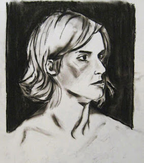
Ink wash is drawing ink that has been diluted with water to create varying strengths of value and is applied with a brush. It can be done with any color of ink, but for our class we are using black. Because ink can't be erased, I suggest that students build values gradually, from barely visible washes to full strength ink if needed. To show how the process works, I started with a subject, the completed charcoal sketch above, and took the drawing through a few stages.

Start with at least two containers, one for clean water and one for your wash, which should just be a few drops of ink in a little water. Test on a scrap, and adjust the mix as necessary. If you wish, sketch your composition out first with light pencil.

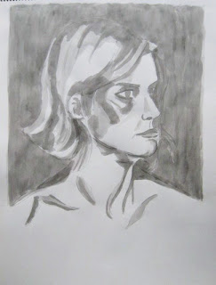
1st State- A very light wash has been applied to the paper everywhere that isn't going to be left white. A few spots got a little extra, but most of the page is one of two values. Even at this stage, light and shadow give some three dimensional modeling to our subject.


2nd State- A darker wash (more ink added to the wash container) has been put over parts of the drawing. Facial features and hair are more defined, and the overall value range has been pushed further, increasing the three dimensional effect. The background separates more from the subject.


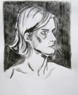
3rd State- A stronger wash is used selectively on the subject to deepen a few key shadows and for local values (eyes/eyebrows). The value range has been extended to at least four values (white page and 3 levels of gray), which makes the modeling seem more gradual even as the range becomes more extreme. The background is darker still, which balances against some of the darker areas of the face and hair and helps push the head and figure more forward.

The above drawing could probably go at least two states darker in some parts, if the goal is to match the original charcoal.

Keep in mind-

*Ink can't be erased. While it is still wet you might be able to blot up some wash with a clean paper towel, but once it's in the paper, it's there for good.

*Ink wash will be significantly lighter when it dries. Between states, give it a few minutes to fully dry and see how dark the drawing truly is. Hanging the single page loosely over the edge of your desk, so air can hit it from both sides, will speed the process.

*When you add ink of any strength to an area that is already very wet, the ink will usually spread into the whole wet area. If you wish to add a little detail to a previously drawn area, let it dry first, and then the ink will only go where your brush directs it.

*Ink can be used full strength if the image calls for solid black areas of value.

*A range of brush sizes can be helpful. The above example was done with a single medium-small round watercolor brush, but large brushes can be helpful for filling large areas more quickly, and smaller brushes for putting in tiny details.

Thursday, November 4, 2010

11/4/10 2D Design

Today's Class- Today we looked at the concept of color temperature, the idea that colors are perceived to feel warm or cool, in themselves or in relation to other colors. I showed slides from art history and the class discussed whether the overall temperature of each image was warm, cool, or balanced/neutral. Then we began a new graded project, a collage related to color temperature. While the class worked on that, a few students printed late wood blocks.

How to make this up- Above is an example of the completed color temperature project from a previous semester. Full details as to how to complete it, as well as additional student examples, can be found here.

Homework- The color temperature graded project is due at the beginning of class on November 18, 2010. However, I strongly suggest that everyone finish the project, or at least the color mixing part, before next week as we will be starting a new graded project at that time.

Those who still have not brought in their woodblock to be printed should do so as soon as possible.

For next class 11/11/10- We will start another color related graded project. The subject will be based on a black and white photograph, so either bring one (preferably a range of values from light to dark) or take your chances on my pile of magazines. Also bring your 18" x 24" pad, pencil and eraser, and all painting stuff- paints, palette, palette knife, brushes, and water container.